
How effective is the combination of your main product and ancillary texts?
Tuesday, 29 March 2011
Monday, 28 March 2011
Evaluation Qu 2
What have you learned from your audience feedback?
Primary Research


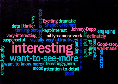
^ Two audience responses to my poster and trailer.
^ Two audience responses to my website.

^ Audience test screening.


As you can see, my predictions were correct about 15-25 year olds being the main target audience, with an older niche audience of over 41’s. However, the 26-40 age group isn’t far behind the main target audience. I think this is because the sort of film that this is appeals to a lot of people. I found it interesting that the majority of the older group weren’t into Gothic horrors, but would have seen the film despite this.
Number of females who would go and see it = 5/6
Number of males who would go and see it = 8/10
Percentage of females = 83%
Percentage of males = 80%
The film is centered around a couple, and statistically romantic films do appeal more to women than men. However the difference is so slight, it is probably unaccountable. It was interesting however that the responses to the question 'What aspect(s) of the narrative interests you most?' were different between men and women. Generally females were more interested in the two main character's relationship, and males were more interested in the killer and action scenes.

Qualitative Research
^ Two audience responses to my poster and trailer.
^ Two audience responses to my website.
Quantitive Research
^ Facebook responses (Link - http://www.facebook.com/home.php?sk=group_199706840051169)
Comments
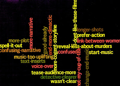
From my questionnaires, the Facebook page, and audience interviews I received lots of positive feedback and useful information about what was effective and how I could improve my tasks. I was glad to find that everyone could tell what genre the film was from each task. I think establishing the genre is very important because a genre indicates to your audience whether they will like the film or not. What most people liked about the trailer was how mysterious it was by not revealing everything, they felt encouraged to go and see the film because they wanted to find out what happens. Most teaser trailers set out to be mysterious because mystery generates interest. I tried to maintain a similar mystery throughout my three tasks. However I also received feedback stating that I should include more narrative in the trailer, for it was apparently too vague.
My poster is meant to quickly capture the audiences interest. It is unconventional of most film posters, for there aren't real images, and it looks hand drawn. I was hoping that this would be a beneficial factor however, that the unconventional look would grab the audience's attention and interest at a first glance. From my audience feedback it seems that the uniqueness of the poster did encourage viewers to want to further explore the film. People said it looked mysterious and suspicious. On facebook, many said they thought the title wasn't big enough, or bold enough and that the poster had to be condensed. I took these suggestions into account and made the changes. One person also said they thought the 15 certificate should be red, so I took this on board also, and changed the colour.
I received a lot of positive feedback for the website. People particularly liked the intro video. I learned that using a short unseen clip like this generates interest and offers my audience more of a taste of the film. One person said she really liked the layout because it was quite different to what she was used to.
Theory
Different audiences use texts in different ways. This is called gratification. I think my text gratifies audiences partly by relieving tension. The frightening or suspenseful moments cause the audience to be stressed for a short while, until the end of the film when the equilibrium is returned and the stress is relieved. This whole process acts as a relaxant. The film also satisfies them by offering them a chance to decode the enigma and be proud of themselves afterwards. Roland Barthes called this the 'Enigma code.'
I would say my text is a readerly text. It makes the audience think, rather than passively take in information. For me, this makes a text substantially more interesting. Throughout the film they have to unfold the murder mystery themselves. I want my text to have multiple effects on different people. Some might sway to one opinion, others might sway to another. How you interoperate a text is based on your social influence and life, and I'd want my text to be one which can have different interpretations. In other words, I imagine the film as being an 'Open' text. My film is possibly an example of Mulvey's 1975 'Male Gaze' theory. An argument which rested on a number of psychoanalytical concepts and assumptions. My film is mainly from the point of view of the man. The theory suggests that men will identify with my main male character, and observe my female character voyeuristically. She stated that men are active viewers and female passive. The women are apparently compelled to take the viewpoint of the male character, and are then denied a viewpoint of their own. Perhaps because of the sex of my main character, male audiences would be satisfied by the film more so than women, however there are other aspects that one can Identify with, for example the theme, problem, or story, and seeing as film is to do with interpretation, the characters are there to merely represent a story, and any person can Identify with a character's story regardless of their sex.
Another narrative code which my trailer is an example of is the Action code. Through the mise en scene, cast and camera work my audience quickly construct the plot themselves form these coded elements, I therefore didn't have to spell everything out. The viewers know that a tall dark handsome man with a gun and a cape is likely to be the hero, and that the masked or ugly character is most definitely the villain and so on.
Another code is the Cultural code. The audience can immediately acknowledge what period the film is and where its set simply through the mise en scene. The costume acts as a signifier for period, as well as the location. The shot of Westminster lets the audience know where the film is set. Barthes said that the 'reader' combines all the data from each code into an overall understanding of the narrative.
I tried to make my film attractive, or pleasing on the eye. Most gothic horrors rely on visuals to gratify their audience. My trailer uses lots of compelling sound effects and snazzy special effects to draw in the potential viewer. I tried to compose my trailer in such a way that it will create an active viewer. I did this through the mystery of the trailer, they are left wondering what will happen, and why it is happening. Perhaps they'll go on to the website for more clues and information.
Sunday, 27 March 2011
Evaluation Qu 1
In what ways does your media product use, develop or challenge forms and conventions of real media products?
Trailer
Poster
My poster is quite unconventional of most posters. Teaser posters are often more daring and more mysterious. For example, the poster for Cloverfield is simply an image of the statue of Liberty with no head, and a date at the bottom.

I tried to make my poster less filmic, and more of arty. There are a few teaser posters that are hand drawn, to give a film a different edge, I conformed to this. I wanted mine to have a slight victorian verisimilitude, or to be a homage to victorian fairground posters or theatrical posters. One poster I've seen which did do this was The Good German. The poster was made to look exactly like a 40's film poster and causes the viewer think, it is a writerly text, rather than readerly. I like it when a film doesn't stop being a film outside of the cinema, with their 40's poster they carry on the transportation effect for the viewer in their everyday lives.

I decided also not to include a tag line. I thought a tagline would make the film seem unreal or unauthentic. I instead did what the film Moulin Rouge! did, which was to have four key words which relate entirely to the film and place them in the poster. Moulin Rouge! Used the words Truth, Beauty, Freedom and Love. I used Duty, Power, Protect and Vengeance.

I did use some conventions however. I used the standard 15 certificate, and added a 'coming soon..' caption. A billing block is also normal to find in a poster, as well the website address. My film isn't big budget so I couldn't simply have a poster with no information, I needed to target my audience quickly and effectively.
The layout of my poster is a very conventional one. Most posters will have the title at the top, the billing block at the bottom, and the actors in the middle. I used this tradition while creating mine.

You could say I have used the conventions of victorian posters to build mine, I researched and studied old victorian posters to get an understanding of what they are like, and took certain aspects and applied them to my own. The borders in mine are highly decorative, which is a given in a victorian poster.


Website
My website is the classic example of a conventional film website. This is probably the most traditional of my three tasks. The layout consists of images around the edge, the title at the top, and the trailer dead in the centre, it is also landscape. This is a very common film website layout. Even the intro video at the beginning is common to have, websites often play the video while the actual website is loading.
^ The website for source code has the exact same layout as mine for example.
A website is multimodal, and I tried to use this to my advantage, for example, after the intro video there is the sound of a crow croaking. Lots of websites use sound effects to create an atmosphere and make a website interactive. I also made mine hypertextual, which is very common. Inspired by other film websites, I added myspace and Facebook links, for the audience to visit.
Saturday, 26 March 2011
Poster Development

I added a photo of Savanh looking into the distance ahead, (but in her direction.) He has no expression so that his mood can be interpreted in different ways. He could be looking sad, or even content, for example. This makes his character mysterious like hers. However, he still remains sophisticated and intelligent looking. I also made the background more opaique and highlighted certain elements of the poster to draw attention to them.


Here I added the stone textured background to the poster. I use it in the trailer for the background of the award graphic. I also added a banner at the top, which will be the title.


Website Intro - first draft
I made this clip using final cut express to animate the images. I played around with the motion settings to make it look like they were landing on an invisible surface. I used the 'curl' filter to for when they're blown away. I made the images using photoshop.
Wednesday, 26 January 2011
Church Location

I went around a lot of churches, asking whether I could film inside, and most were closed or said no, or the church didn't look nice enough, but then I found what I considered to be the one, and went inside to ask the vicar. He was very friendly and gave us permission, we shot later that day.

Poster Research


I think the theme for my poster should be in the style of old victorian posters. They are highly decorative, often in bright but non-garish colours, like navy blues and deep reds. They encompass the victorian era with quite sinister drawings. There is probably an effect on photoshop, where I could make a photograph look like a drawing, this would be useful.
Wednesday, 19 January 2011


Monday, 17 January 2011
More posters

I'd like to have an effect like this for the woman in my film, as if she is a ghostly memory. It also keeps with the period of the film.
Wednesday, 12 January 2011
Poster Ideas

I like how this poster gives the impression that the story within the film is real. Here, you notice the poster before the film title. It is made to look like a poster issued by the government, as a result of a virus escaping into the city. It therefore shocks you before you realize its just for a film. This kind of poster makes a film feel like more than a film; it engages the audience by effecting them in their day to day life, taking itself seriously even outside the film and therefore making it seem more believable. This causes more of an excitement to see it.

I like film posters like 'The Good German' where they embrace the period of the film extensively. The poster is made to look like an old film poster, like the ones during the war. This technique, similarly to the '28 weeks later' poster, creates an active audience, outside of the film. The film is a homage to 1940s films, for example, being in black and white, and the poster reflects this too.
My poster could create an active audience by being a missing persons poster, for example.
Tuesday, 21 December 2010
Lighting

This is an attempt I made at a gobo for the bedroom scene. It was meant to shine light coming from a window onto the room, however it didn't work and I instead used it to diffuse the light and give it some texture.
Monday, 20 December 2010
Set Dressings


These are some Victorian vignettes I've made of the detective and his wife, that are to be hung up on the wall of the bedroom scene. I used photoshop to turn photographs of the actors into silhouettes and also added a feathered circular border. Below are examples of real victorian silhouettes.

Sunday, 19 December 2010
Location - Pool Scene

For the scene where the girl falls into a river, I needed a pool. Luckily my friend Iona had one in her house. It had dark tiles on the inside, which will make it easier to merge with the background shot of the river Thames. It also conveniently had a glass roof, so I could film a shot of the actress from above. I gave her a white nightdress to wear. I lit the scene with one battery light on the water, and one Angle poised lamp to highlight the her jumping in. We did a few test jumps in her swimwear, then did a few in her costume. I also experimented with the slow motion function on my camera which looked really cool.
Saturday, 18 December 2010
Another Location

After recently going to St Thomas' hospital, I was amazed to see the perfect view of big ben, across the Thames. I decided it would be great for an establishing shot within the trailer. It would also add a more professional feel to the trailer. If I shoot it well, there wont be any modern buildings/cars etc, which would ruin the shot.

An old photo of Big Ben.
Thursday, 16 December 2010
Actors So Far

Victim 1

This is her in costume and with makeup. She has very little make-up to show her youth and virginal qualities. The red lipstick dramatizes the look. I also curled her hair slightly. Her dress has a timeless quality to it, and the colour goes really well with her pale skin tone.
The actress playing victim 1 is Sylvie Markes, she has large gloomyeyes and a look of innocence about her.

The detective
The actor playing the detective is Savanh Phaophanit. He is handsome, and has a young and fresh but at the same time sophisticated look about him.

Savanh pictured above in costume and make-up. I made him look paler and styled his hair in a more formal manner. The detective is dressed elegantly in monochrome colours, to signify his ability to be impartial. He wears a velvet cape. He also holds a top hat in his hand.
His wife
His wife is played by Melissa Thompson, who is pretty and has an iconic, memorable face.

The Gravedigger
The grave digger is played by Eddie Markes. A great actor who can undertake cameo roles brilliantly.


Eddie in makeup and costume. A few days before filming I asked him not to shave, so that he would look less groomed. I used brown makeup on his face to make him look dirty, put black beneath his fingernails. Gave him black-outs for his teeth, roughed his eyebrow hair up, and darkened his eyes. He wears tatty clothing, almost as though its the clothing he's taken from the dead. He wears a delicately patterned embroidered waistcoat over a collarless shirt, with a cravat and a brown cape and finally a creased black hat. I gave him rosary beads, for being a gravedigger he would want to protect himself from evil spirits. His costume is predominantly made up of different shades of brown, to relate him to the earth at which he labors. He carries a lit wooden lantern.
Main Title Ideas
These are different versions of possible titles. Im hoping to superimpose the titles over a shot of an alley-way wall, or perhaps a dark scene with the murderer subtly in the background. Or perhaps over the killer's calling card (which is positioned above) falling onto a dead body. Or I could simply lay them over a textured image. The name is just a working title.
My initial idea was to have a misty scene, and then the mist slowly forming the title.
This version is the simplest. The mist seeps in to form the white letters.
This version is just an experiment, it was meant to be reminiscent of water.
The red version.
This version is the one I like the most, although the smoke needs to fade away at a slower pace. I think this is the most creepy version. I'm planning to work into it, to make it look more professional.
Wednesday, 15 December 2010
Soundtrack
This piece of music works really well for the beginning section of the trailer. It is minimal, and leaves you feeling cold. It is quite timeless, which works with the film being period. The very beginning is similar to the sound effect I created but more epic, and less electronic sounding. I put it to the footage I have filmed so far, and the timing was near perfect, I'll just have to make a few tweaks to move around some of the beats. The music later on becomes very sinister and eerie, and I have not yet decided whether I will use this section or not.
Monday, 13 December 2010
Poster Inspiration


The Frankenstein poster is very simple, the main photo creates mystery and will be understood by people who know the story. Generating an active audience. The photos along the bottom, show all the main stars. The lightening font is quite cheesy but tolerable for the film is quite old now. It also relates to one of the key elements of the story.
Although the Jane Erye isn't gothic i really like the simplicity of the poster. I also like the pastel colours and the minimal font. The title font is in a sort of foreground, making the image look slightly 3D. Within 'Jane's' dress we see another characters face, it is quite subtle but effective.
Subscribe to:
Posts (Atom)

