
Wednesday, 6 April 2011

Tuesday, 5 April 2011
Friday, 1 April 2011
Evaluation Qu 4


Tuesday, 29 March 2011
Monday, 28 March 2011
Evaluation Qu 2
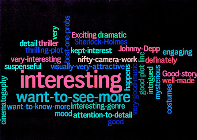
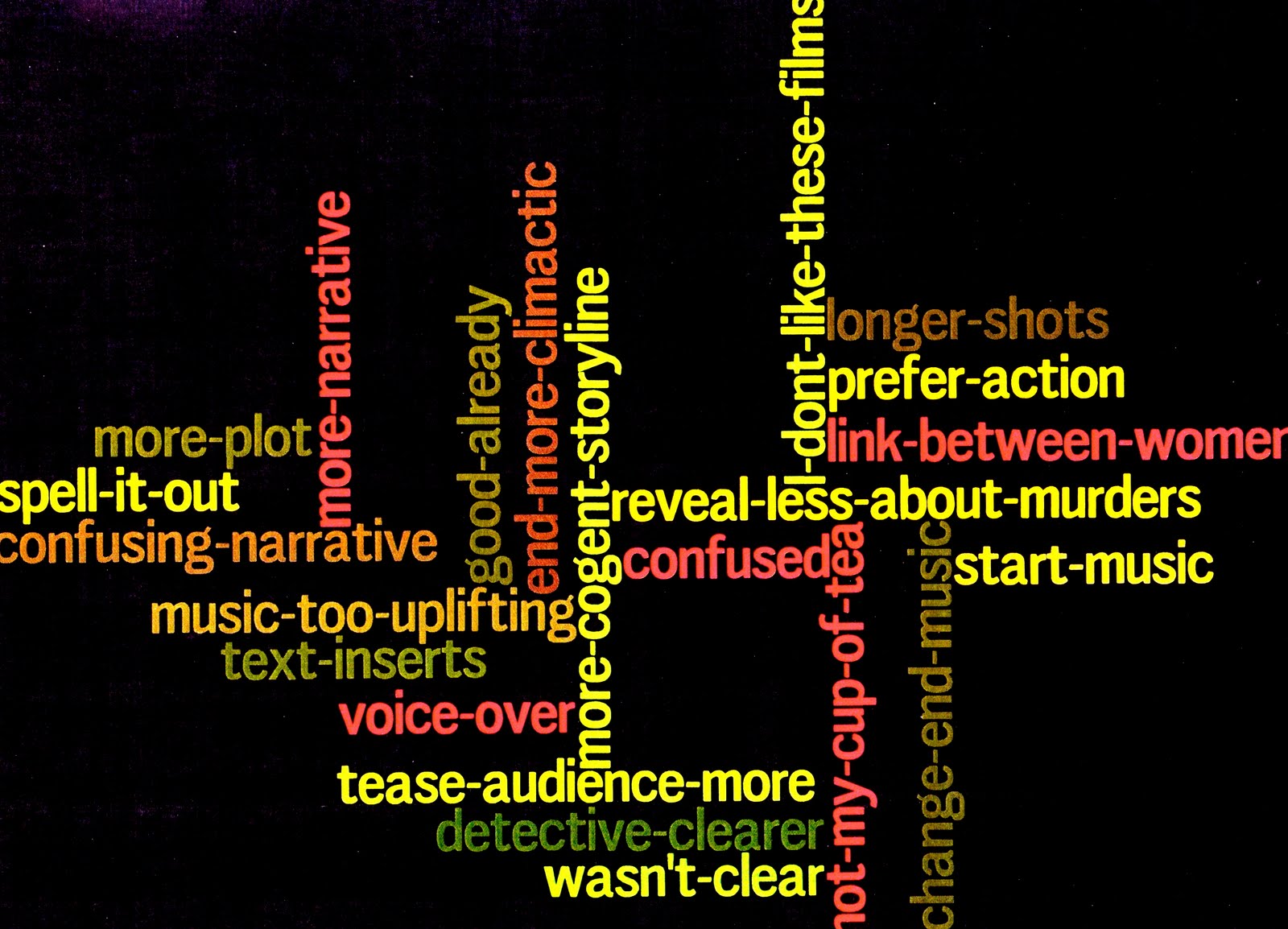
What have you learned from your audience feedback?


As you can see, my predictions were correct about 15-25 year olds being the main target audience, with an older niche audience of over 41’s. However, the 26-40 age group isn’t far behind the main target audience. I think this is because the sort of film that this is appeals to a lot of people. I found it interesting that the majority of the older group weren’t into Gothic horrors, but would have seen the film despite this.
Number of females who would go and see it = 5/6
Number of males who would go and see it = 8/10
Percentage of females = 83%
Percentage of males = 80%
The film is centered around a couple, and statistically romantic films do appeal more to women than men. However the difference is so slight, it is probably unaccountable. It was interesting however that the responses to the question 'What aspect(s) of the narrative interests you most?' were different between men and women. Generally females were more interested in the two main character's relationship, and males were more interested in the killer and action scenes.
^ Two audience responses to my poster and trailer.
^ Two audience responses to my website.

My poster is meant to quickly capture the audiences interest. It is unconventional of most film posters, for there aren't real images, and it looks hand drawn. I was hoping that this would be a beneficial factor however, that the unconventional look would grab the audience's attention and interest at a first glance. From my audience feedback it seems that the uniqueness of the poster did encourage viewers to want to further explore the film. People said it looked mysterious and suspicious. On facebook, many said they thought the title wasn't big enough, or bold enough and that the poster had to be condensed. I took these suggestions into account and made the changes. One person also said they thought the 15 certificate should be red, so I took this on board also, and changed the colour.
I received a lot of positive feedback for the website. People particularly liked the intro video. I learned that using a short unseen clip like this generates interest and offers my audience more of a taste of the film. One person said she really liked the layout because it was quite different to what she was used to.
I would say my text is a readerly text. It makes the audience think, rather than passively take in information. For me, this makes a text substantially more interesting. Throughout the film they have to unfold the murder mystery themselves. I want my text to have multiple effects on different people. Some might sway to one opinion, others might sway to another. How you interoperate a text is based on your social influence and life, and I'd want my text to be one which can have different interpretations. In other words, I imagine the film as being an 'Open' text. My film is possibly an example of Mulvey's 1975 'Male Gaze' theory. An argument which rested on a number of psychoanalytical concepts and assumptions. My film is mainly from the point of view of the man. The theory suggests that men will identify with my main male character, and observe my female character voyeuristically. She stated that men are active viewers and female passive. The women are apparently compelled to take the viewpoint of the male character, and are then denied a viewpoint of their own. Perhaps because of the sex of my main character, male audiences would be satisfied by the film more so than women, however there are other aspects that one can Identify with, for example the theme, problem, or story, and seeing as film is to do with interpretation, the characters are there to merely represent a story, and any person can Identify with a character's story regardless of their sex.
Another narrative code which my trailer is an example of is the Action code. Through the mise en scene, cast and camera work my audience quickly construct the plot themselves form these coded elements, I therefore didn't have to spell everything out. The viewers know that a tall dark handsome man with a gun and a cape is likely to be the hero, and that the masked or ugly character is most definitely the villain and so on.
Another code is the Cultural code. The audience can immediately acknowledge what period the film is and where its set simply through the mise en scene. The costume acts as a signifier for period, as well as the location. The shot of Westminster lets the audience know where the film is set. Barthes said that the 'reader' combines all the data from each code into an overall understanding of the narrative.
I tried to make my film attractive, or pleasing on the eye. Most gothic horrors rely on visuals to gratify their audience. My trailer uses lots of compelling sound effects and snazzy special effects to draw in the potential viewer. I tried to compose my trailer in such a way that it will create an active viewer. I did this through the mystery of the trailer, they are left wondering what will happen, and why it is happening. Perhaps they'll go on to the website for more clues and information.
Sunday, 27 March 2011
Evaluation Qu 1
In what ways does your media product use, develop or challenge forms and conventions of real media products?
Trailer
Poster
My poster is quite unconventional of most posters. Teaser posters are often more daring and more mysterious. For example, the poster for Cloverfield is simply an image of the statue of Liberty with no head, and a date at the bottom.

I tried to make my poster less filmic, and more of arty. There are a few teaser posters that are hand drawn, to give a film a different edge, I conformed to this. I wanted mine to have a slight victorian verisimilitude, or to be a homage to victorian fairground posters or theatrical posters. One poster I've seen which did do this was The Good German. The poster was made to look exactly like a 40's film poster and causes the viewer think, it is a writerly text, rather than readerly. I like it when a film doesn't stop being a film outside of the cinema, with their 40's poster they carry on the transportation effect for the viewer in their everyday lives.

I decided also not to include a tag line. I thought a tagline would make the film seem unreal or unauthentic. I instead did what the film Moulin Rouge! did, which was to have four key words which relate entirely to the film and place them in the poster. Moulin Rouge! Used the words Truth, Beauty, Freedom and Love. I used Duty, Power, Protect and Vengeance.

I did use some conventions however. I used the standard 15 certificate, and added a 'coming soon..' caption. A billing block is also normal to find in a poster, as well the website address. My film isn't big budget so I couldn't simply have a poster with no information, I needed to target my audience quickly and effectively.
The layout of my poster is a very conventional one. Most posters will have the title at the top, the billing block at the bottom, and the actors in the middle. I used this tradition while creating mine.

You could say I have used the conventions of victorian posters to build mine, I researched and studied old victorian posters to get an understanding of what they are like, and took certain aspects and applied them to my own. The borders in mine are highly decorative, which is a given in a victorian poster.


Website
My website is the classic example of a conventional film website. This is probably the most traditional of my three tasks. The layout consists of images around the edge, the title at the top, and the trailer dead in the centre, it is also landscape. This is a very common film website layout. Even the intro video at the beginning is common to have, websites often play the video while the actual website is loading.
^ The website for source code has the exact same layout as mine for example.
A website is multimodal, and I tried to use this to my advantage, for example, after the intro video there is the sound of a crow croaking. Lots of websites use sound effects to create an atmosphere and make a website interactive. I also made mine hypertextual, which is very common. Inspired by other film websites, I added myspace and Facebook links, for the audience to visit.
Saturday, 26 March 2011
Poster Development


Website Intro - first draft
Wednesday, 26 January 2011
Church Location

I went around a lot of churches, asking whether I could film inside, and most were closed or said no, or the church didn't look nice enough, but then I found what I considered to be the one, and went inside to ask the vicar. He was very friendly and gave us permission, we shot later that day.

Poster Research


Wednesday, 19 January 2011


Monday, 17 January 2011
More posters

Wednesday, 12 January 2011
Poster Ideas


